Physical Address
304 North Cardinal St.
Dorchester Center, MA 02124
Physical Address
304 North Cardinal St.
Dorchester Center, MA 02124

In this step-by-step tutorial, we’ll learn how to setup a Vite and React application to easily build our Portfolio Website. ViteJS, known for its lightning-fast build times, pairs perfectly with React’s component-based architecture to create a smooth, responsive user experience.
First thing we need to do is create a NextJS project with Vite. Open a new terminal and in your preferred folder run the commands below.
npm create vite@latest my-portfolio -- --template react-ts
cd my-portfolio
npm install
This will setup a new Vite project with React, TypeScript and NextJS.
This is the file and folder structure I recommend you start out with especially for this tutorial. But feel free to customize it for your future projects after you get comfortable. Look below and make sure to create the files and folders that are missing as well as remove the files if you have extra.
my-portfolio/
├── public/
├── src/
│   ├── assets/
│   │   ├── laptop-photo.jpg
│   ├── components/
│   │   ├── Header.tsx
│   │   ├── About.tsx
│   │   ├── Projects.tsx
│   │   └── Contact.tsx
│   ├── App.css
│   ├── App.tsx
│   ├── main.tsx
│   └── vite-env.d.ts
├── index.html
├── package.json
├── tsconfig.json
├── vite.config.ts
└── README.md
This is a very straightforward project so far and the only thing you might need to add is a real .jpg file to show some kind of image in our page.
Great if you have something like this then we’re done with config for now and can start building.
The main entry point is main.tsx but we don’t need to really touch that right now unless we were adding something like Context API for state management.
So let’s open up App.tsx and update it to look like below.
import React from "react"
// import Header from "./components/Header"
// import About from "./components/About"
// import Projects from "./components/Projects"
// import Contact from "./components/Contact"
// import "./App.css"

const App: React.FC = () => {
  return (
    <div className="App">
      {/* <Header /> */}
      <main>
        {/* <About /> */}
        {/* <Projects /> */}
        {/* <Contact /> */}
      </main>
    </div>
  )
}

export default App
As you may have noticed I am adding some comments of imports and components because that is how we will structure the Portfolio app. We’ll have a main Header with things like our navigational links. Then inside the main tag we will have three sections: about, projects and contact.
From here we will creating React components so create a new components folder inside of src directory. Then a new file called Header.tsx and let’s write the following code:
import React from 'react';

const Header: React.FC = () => {
  return (
    <div>
      <h1>Joe Smith</h1>
      <nav>
        <a href="#about">About</a>
        <a href="#projects">Projects</a>
        <a href="#contact">Contact</a>
      </nav>
    </div>
  );
};

export default Header;
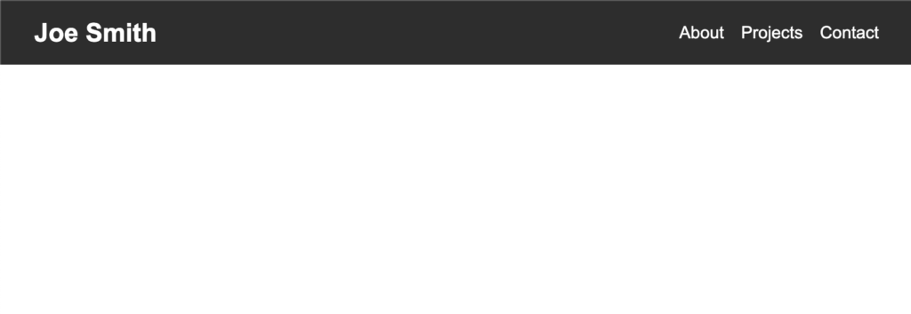
To see how this will look like, let’s uncomment out the Header import and component in App.tsx then start the vite server. To start the server run the command below.
npm run devAfter a few seconds we have our app running by default on http://localhost:5173/

For this project I will be adding vanilla CSS but feel free to use something like Tailwind or any other library to help you style your project.
To keep things separate and easy to follow I will create a CSS file for each of our component files. So for Header.tsx I will create a Header.css in the /components folder.
So the updated Header.tsx will be:
import React from "react"
import "./Header.css"

const Header: React.FC = () => {
  return (
    <header className="header">
      <div className="header-content">
        <h1 className="name">Joe Smith</h1>
        <nav className="nav">
          <a href="#about">About</a>
          <a href="#projects">Projects</a>
          <a href="#contact">Contact</a>
        </nav>
      </div>
    </header>
  )
}

export default Header
Then the updated Header.css will be:
.header {
  background-color: #333;
  color: #fff;
  padding: 1rem 2rem;
}

.header-content {
  display: flex;
  justify-content: space-between;
  align-items: center;
  max-width: 1200px;
  margin: 0 auto;
}

.name {
  font-size: 1.5rem;
  margin: 0;
}

.nav {
  display: flex;
  gap: 1rem;
}

.nav a {
  color: #fff;
  text-decoration: none;
  font-size: 1rem;
  transition: color 0.3s ease;
}

.nav a:hover {
  color: #ddd;
}
So with these changes our header will look much better.

For the next three components I will speed it up since you can customize it to your preference. Create a About.tsx and About.css inside /components folder.
For About.tsx let’s add:
import React from "react"
import "./About.css"
import laptop from "../assets/laptop-photo.jpg"

const About: React.FC = () => {
  return (
    <section id="about" className="about">
      <div className="about-content">
        <div className="about-text">
          <h2>About Me</h2>
          <p>
            Hello! I'm a passionate web developer with experience in React and modern web technologies. I love creating intuitive and efficient user interfaces.
          </p>
          <p>
            When I'm not coding, you can find me hiking in the mountains or experimenting with new recipes in the kitchen.
          </p>
        </div>
        <div className="about-image">
          <img src={laptop} alt="Your Name" />
        </div>
      </div>
    </section>
  )
}

export default About
Then the About.css I have it as:
.about {
  padding: 4rem 2rem;
  background-color: #f8f8f8;
}

.about-content {
  display: flex;
  justify-content: space-between;
  align-items: center;
  max-width: 1200px;
  margin: 0 auto;
}

.about-text {
  flex: 1;
  padding-right: 2rem;
  max-width: 500px;
}

.about-text h2 {
  font-size: 2rem;
  color: #333;
  margin-bottom: 1rem;
}

.about-text p {
  font-size: 1rem;
  color: #666;
  line-height: 1.6;
  margin-bottom: 1rem;
}

.about-image {
  flex: 0 0 300px;
}

.about-image img {
  width: 100%;
  height: auto;
  box-shadow: 0 4px 6px rgba(0, 0, 0, 0.1);
}

@media (max-width: 768px) {
  .about-content {
    flex-direction: column-reverse;
  }

  .about-text {
    padding-right: 0;
    padding-top: 2rem;
  }

  .about-image {
    flex: 0 0 200px;
  }
}
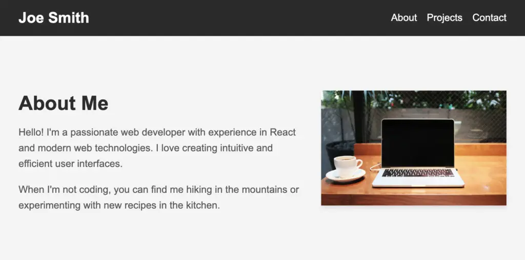
You can customize it however you want but for now this will do. With all the changes it should look like this.

Now we’ll work on the Projects component and display a card with image, project name and description. I will use some project images from google randomly and they will also be different file types but will all work the same.
import React from "react"
import "./Projects.css"
import project1 from "../assets/project1.jpg"
import project2 from "../assets/project2.png"
import project3 from "../assets/project3.avif"
import project4 from "../assets/project4.webp"

const Projects: React.FC = () => {
  const projects = [
    {
      title: "E-commerce Platform",
      description:
        "A full-stack e-commerce solution built with React and Node.js.",
      imageUrl: project1,
    },
    {
      title: "Weather App",
      description:
        "A responsive weather application using React Native and a third-party API.",
      imageUrl: project2,
    },
    {
      title: "Task Management Tool",
      description:
        "A productivity app built with React Native and Firebase for real-time updates.",
      imageUrl: project3,
    },
    {
      title: "Rental App",
      description:
        "A modern rental application built with React Native and Node.js.",
      imageUrl: project4,
    },
  ]

  return (
    <section id="projects" className="projects">
      <div className="projects-content">
        <h2>My Projects</h2>
        <div className="project-grid">
          {projects.map((project, index) => (
            <div key={index} className="project-card">
              <img src={project.imageUrl} alt={project.title} />
              <h3>{project.title}</h3>
              <p>{project.description}</p>
            </div>
          ))}
        </div>
      </div>
    </section>
  )
}

export default Projects
So now the Projects.css will be:
.projects {
  padding: 4rem 2rem;
  background-color: #fff;
}

.projects-content {
  max-width: 1200px;
  margin: 0 auto;
}

.projects-content h2 {
  font-size: 2rem;
  color: #333;
  margin-bottom: 2rem;
  text-align: center;
}

.project-grid {
  display: grid;
  grid-template-columns: repeat(auto-fit, minmax(300px, 1fr));
  gap: 2rem;
}

.project-card {
  background-color: #f8f8f8;
  border-radius: 8px;
  overflow: hidden;
  box-shadow: 0 4px 6px rgba(0, 0, 0, 0.1);
  transition: transform 0.3s ease;
}

.project-card:hover {
  transform: translateY(-5px);
}

.project-card img {
  width: 100%;
  height: 200px;
  object-fit: cover;
}

.project-card h3 {
  font-size: 1.25rem;
  color: #333;
  margin: 1rem;
}

.project-card p {
  font-size: 1rem;
  color: #666;
  margin: 0 1rem 1rem;
  line-height: 1.5;
}

@media (max-width: 768px) {
  .project-grid {
    grid-template-columns: 1fr;
  }
}
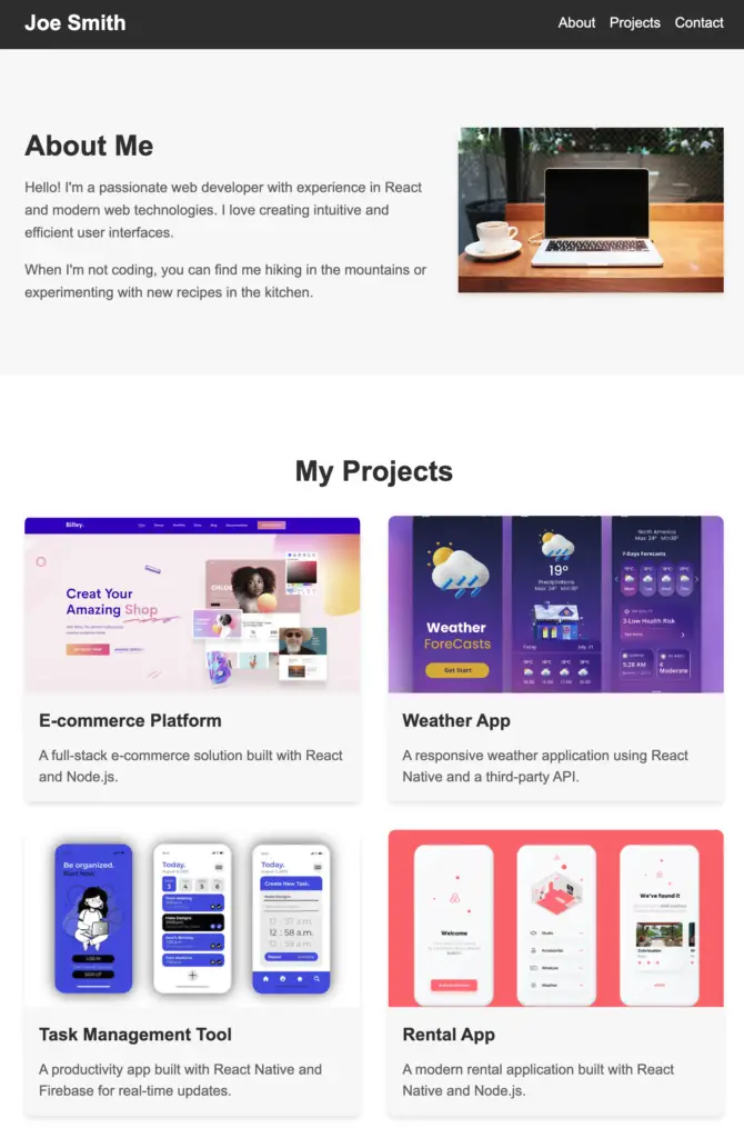
With this our portfolio app is coming along great. Let’s take a look:

As a reminder the width I’m in right now is showing 2 on each row but on a wider page it will have 3 in one row. But you can update the CSS or number of projects easily to make it look the way you want it to. You can even build a slideshow component to show them all in one line but let’s keep it simple for now.
Our last component is the contact form so for that let’s create a Contact.tsx and add this code:
import React, { useState } from "react"
import "./Contact.css"

const Contact: React.FC = () => {
  const [name, setName] = useState("")
  const [email, setEmail] = useState("")
  const [message, setMessage] = useState("")

  const handleSubmit = (e: React.FormEvent<HTMLFormElement>) => {
    e.preventDefault()
    // Here you would typically handle the form submission,
    // such as sending the data to a server or API
    console.log("Form submitted:", { name, email, message })
    // Reset form fields
    setName("")
    setEmail("")
    setMessage("")
  }

  return (
    <section id="contact" className="contact">
      <div className="contact-content">
        <h2>Contact Me</h2>
        <form onSubmit={handleSubmit}>
          <div className="form-group">
            <label htmlFor="name">Name</label>
            <input
              type="text"
              id="name"
              value={name}
              onChange={(e) => setName(e.target.value)}
              required
            />
          </div>
          <div className="form-group">
            <label htmlFor="email">Email</label>
            <input
              type="email"
              id="email"
              value={email}
              onChange={(e) => setEmail(e.target.value)}
              required
            />
          </div>
          <div className="form-group">
            <label htmlFor="message">Message</label>
            <textarea
              id="message"
              value={message}
              onChange={(e) => setMessage(e.target.value)}
              required
            ></textarea>
          </div>
          <button type="submit">Send Message</button>
        </form>
      </div>
    </section>
  )
}

export default Contact
Then the Contact.css file:
.contact {
  padding: 4rem 2rem;
  background-color: #f8f8f8;
}

.contact-content {
  max-width: 600px;
  margin: 0 auto;
}

.contact h2 {
  font-size: 2rem;
  color: #333;
  margin-bottom: 2rem;
  text-align: center;
}

.form-group {
  margin-bottom: 1.5rem;
}

.form-group label {
  display: block;
  margin-bottom: 0.5rem;
  color: #333;
  font-weight: bold;
}

.form-group input,
.form-group textarea {
  width: 100%;
  padding: 0.75rem;
  border: 1px solid #ddd;
  border-radius: 4px;
  font-size: 1rem;
}

.form-group textarea {
  height: 150px;
  resize: vertical;
}

button[type="submit"] {
  display: block;
  width: 100%;
  padding: 1rem;
  background-color: #333;
  color: #fff;
  border: none;
  border-radius: 4px;
  font-size: 1rem;
  cursor: pointer;
  transition: background-color 0.3s ease;
}

button[type="submit"]:hover {
  background-color: #555;
}

@media (max-width: 768px) {
  .contact-content {
    max-width: 100%;
  }
}
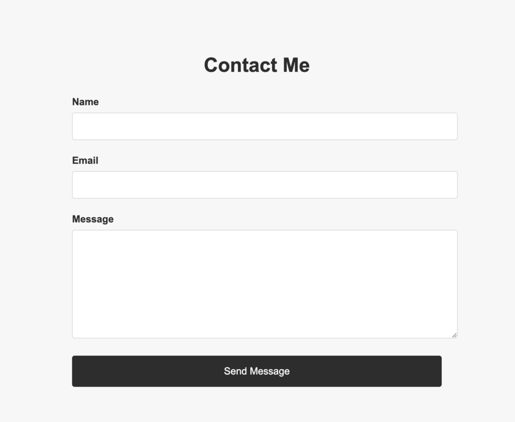
Perfect and uncomment the import and component in the App.tsx and at the bottom you should see this:

Note currently I’ve left some comments in the Contact component itself leaving the form submit action open to what you wish to do. I will leave you with two ideas:
This is the simplest approach, using the native mailto functionality:
const handleSubmit = (e: React.FormEvent<HTMLFormElement>) => {
  e.preventDefault();
  const mailtoLink = `mailto:[email protected]?subject=Portfolio Contact from ${name}&body=${message}%0D%0A%0D%0AFrom: ${name}%0D%0AEmail: ${email}`;
  window.location.href = mailtoLink;
};
Pros:
Cons:
To use EmailJS, you’d need to sign up for an account and set up a template.
Pros:
Cons:
If you are interested in this I have written: How to send emails in a React App using EmailJS – Full Tutorial and went into depth on how to setup an EmailJS account as well as testing receiving an email into my Gmail account.
I will highly recommend you check this out and at least learn how to set it up in less than 10 minutes.
To give it a professional touch we will add a simple footer so let’s update App.tsx:
import React from "react"
import Header from "./components/Header"
import About from "./components/About"
import Projects from "./components/Projects"
import Contact from "./components/Contact"
import "./App.css"

const App: React.FC = () => {
  return (
    <div className="App">
      <Header />
      <main>
        <About />
        <Projects />
        <Contact />
      </main>
      <footer>
        <p>© 2024 Joe Smith. All rights reserved.</p>
      </footer>
    </div>
  )
}

export default App
And in our App.css:
body {
  font-family: Arial, sans-serif;
  line-height: 1.6;
  margin: 0;
  padding: 0;
}

.App {
  display: flex;
  flex-direction: column;
  min-height: 100vh;
}

main {
  flex: 1;
}

footer {
  background-color: #333;
  color: #fff;
  text-align: center;
}
The footer will look like this:

Congrats! In this tutorial we learned how to setup a Vite and React app and build our own Portfolio Website. From here you can look into optimizing images and updating styling and even adding more sections if you wish. In my opinion, the simpler the better.
If you wish to deploy this then I would encourage you to check out Vercel as they make it easy to deploy especially if you push this up to Github then it’s just a few clicks and your website will be live!
If you rather not go through all the steps and create your portfolio website in minutes with zero setup then I encourage you to try out our app MyDevPage and create your portfolio website with ease. We take care of all the hard work so you can get it up live and forget about it.